For Business Owners, Marketers & Entrepreneurs
Introduction: Why CRO is the Hidden Growth Lever
Most store owners believe that more traffic equals more sales. But traffic without optimisation is like pouring water into a leaky bucket. CRO (Conversion Rate Optimisation) is about sealing the leaks so every visitor has the smoothest possible path to purchase.
- Imagine a brick-and-mortar store: You’ve set up a beautiful shop on the busiest street (traffic). But if your aisles are cluttered, signs are confusing, checkout is slow, and staff don’t help, people leave without buying.
- CRO is the digital equivalent: making the buying journey as frictionless as possible.
💡 Benchmark: Industry average e-commerce conversion rates sit around 2–3%. With CRO, many stores reach 5–10% or higher — without spending more on ads.
General CRO Checkpoints
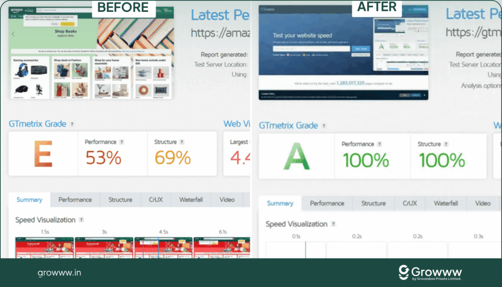
1. Fast Loading Pages (Under 5 Seconds)
Why it matters: 53% of mobile users abandon sites that take longer than 3 seconds. Amazon once calculated that a 100ms delay cost them 1% in sales.
DIY Fixes:
- Compress images using tools like TinyPNG or WebP format.
- Use a CDN (Content Delivery Network) like Cloudflare.
- Remove unused plugins/apps.
Case Example:
A Shopify store selling handmade jewellery reduced homepage size by 40% (optimised product photos). Their bounce rate dropped 18%, and conversions improved 22% in 30 days.
2. Every Page Has a CTA (Even 404 Pages)
Why it matters: Dead ends kill sales momentum. A visitor landing on a broken page or reading a blog post should still have a way forward.
DIY Fixes:
- On a 404 page, add: “Oops! That page isn’t here. But you can shop our best-sellers → [Shop Now]”.
- On blog posts: End with “Loved this guide? Explore our skincare range → [View Products]”.
Case Example:
Zappos uses its 404 page to showcase its funniest shoes — turning a mistake into a discovery moment.

3. Buttons Look Clickable
Why it matters: If shoppers don’t realise something is clickable, they won’t click.
DIY Fixes:
- Use hover states (button changes color when hovered).
- Underline links.
- Add icons (e.g. 🛒 next to “Add to Cart”).
Analogy: In a supermarket, if the checkout counter isn’t visibly marked, people won’t know where to pay.
4. Wishlist as a “Low-Commitment First Step”
Why it matters: Not everyone buys on first visit. A wishlist lets them “save for later” — capturing intent without checkout friction.
DIY Fixes:
- Add a simple heart icon on product cards.
- Sync wishlist to logged-in user accounts so items reappear later.
Case Example:
Urban Outfitters increased email capture rates by 17% by nudging users to “Save your wishlist — sign in to keep it.”
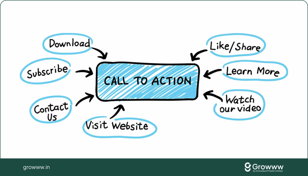
5. Clear & Action-Oriented CTAs
Why it matters: Generic labels like “Submit” confuse. Action words like “Shop Now,” “Get Offer,” “Start Free Trial” tell users exactly what happens next.
DIY Fixes:
- Start button text with a verb.
- Add urgency if relevant (“Claim Discount Today”).
Analogy: In physical retail, signs say “Checkout Here,” not just “Form.”
6. Subtle Micro-Animations
Why it matters: Movement draws attention. A gentle pulse on your Add-to-Cart button can increase clicks without being annoying.
DIY Fixes:
- Use CSS hover effects.
- Animate urgency badges (“Only 3 left!” fading in).
Case Example:
A DTC skincare brand added a micro-bounce effect to their main “Shop Now” button → click-through increased by 8%.
7. No Annoying Popups
Why it matters: A pop-up that appears too early (before the user even scrolls) causes frustration.
DIY Fixes:
- Time popups: show after 30–40 seconds or exit intent.
- Offer something valuable (10% off, free shipping, useful guide).
Navigation CRO Checkpoints
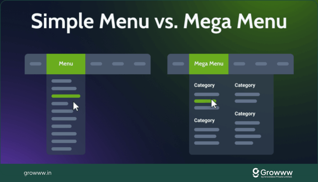
1. Broad & Shallow Navigation (Not Deep & Confusing)
Why it matters:
- Users don’t want to click through 5 menus to find a product.
- A broad menu (e.g. “Men → Shoes → Sneakers”) is easier than deep nested levels (e.g. “Men → Footwear → Sports → Shoes → Sneakers”).
DIY Fixes:
- Use a mega menu instead of drop-downs that expand endlessly.
- Highlight popular categories at the top.
Case Example:
Nike.com uses a broad mega menu where users instantly see Men, Women, Kids, Sports, and even Promotions. Their search time is reduced, boosting conversions.
2. Clear Navigational Feedback
Why it matters:
- Users need to know where they are. Without feedback, they feel lost.
- Highlighting the current section increases orientation.
DIY Fixes:
- Add an “active state” highlight (e.g. “You are viewing: Dresses”).
- Use breadcrumbs (e.g. Home → Women → Dresses → Maxi Dress).
Example:
Amazon shows both breadcrumbs and “active” filter chips so users know their path.
3. Logical Order of Items
Why it matters:
- Humans scan menus top-to-bottom.
- If legal links (e.g. Terms, Privacy) clutter the main nav, users get distracted.
DIY Fixes:
- Put core shopping categories first.
- Place legal/less important links in the footer.
Analogy: Grocery stores don’t put “Legal Info” signs at the entrance; they put “Fresh Produce” first.
4. Sticky Navigation
Why it matters:
- Mobile users especially hate scrolling back up to access menu/cart.
- Sticky nav ensures cart, search, and categories are always in reach.
DIY Fixes:
- Implement a sticky top bar with logo, search, and cart.
- For mobile, use a sticky bottom nav with icons (Home, Categories, Search, Cart).
Example:
H&M’s mobile app uses a sticky bottom bar for constant accessibility.
Search Bar CRO Checkpoints
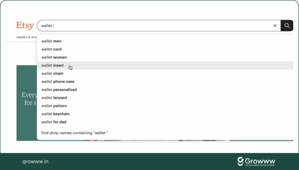
1. Prominent Search Box
Why it matters:
- 30% of users go straight to the search bar. If it’s hidden, you lose conversions.
DIY Fixes:
- Place it top-right or center on desktop.
- Use a magnifying glass icon for universal recognition.
Example:
Etsy’s homepage has a giant, friendly search bar — because users often search for specific handmade products.
2. Auto-Complete & Auto-Suggest
Why it matters:
- Users may not know the exact spelling or category.
- Suggesting results saves typing and prevents frustration.
DIY Fixes:
- Use tools like Algolia or Elasticsearch.
- Suggest both products and categories.
Example:
Typing “red” on Zara.com shows “Red Dress, Red Shoes, Red Bags” instantly.
3. Intelligent “No Results” Pages
Why it matters:
- Dead ends cause drop-offs.
- A helpful “no results” page keeps users shopping.
DIY Fixes:
- Show “Did you mean ___?” with spelling corrections.
- Recommend best-sellers or related items.
Example:
Sephora’s search returns “No results for X — but here are trending items”. This prevents abandonment.
4. Mobile-Friendly Search
Why it matters:
- Typing on mobile is harder. A short, hidden search bar frustrates users.
DIY Fixes:
- Use a long, full-width search bar.
- Enable voice search if possible.
Analogy: In a physical store, asking a staff member should be fast. Search is your digital staff.
Cart Widget CRO Checkpoints
1. Cart is Always Accessible
Why it matters:
- If users can’t find the cart, they abandon.
- Cart visibility reassures them their selections are saved.
DIY Fixes:
- Top-right corner (desktop) or sticky bottom icon (mobile).
- Show item count badge.
Example:
ASOS uses a bag icon with live item count — always visible.
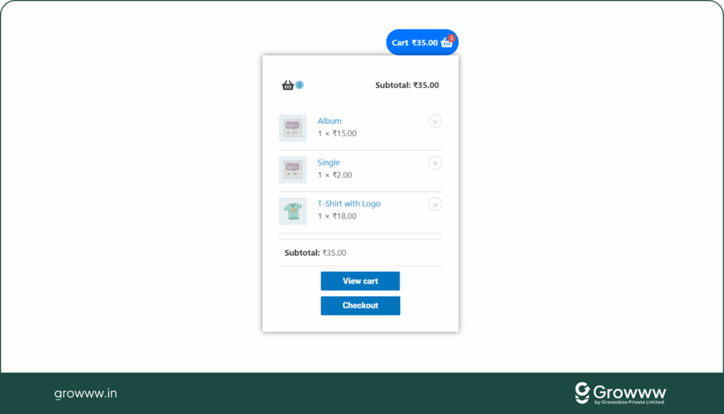
2. Mini-Cart Preview (On Hover / Slide-In)
Why it matters:
- Users want to see their cart without losing context.
- Reduces friction before checkout.
DIY Fixes:
- Include product thumbnails, quantity, price, and subtotal.
- Add a CTA → “Proceed to Checkout.”
Case Example:
Fashion Nova’s mini-cart has urgency copy (“Almost gone!”) which increased their AOV (average order value).
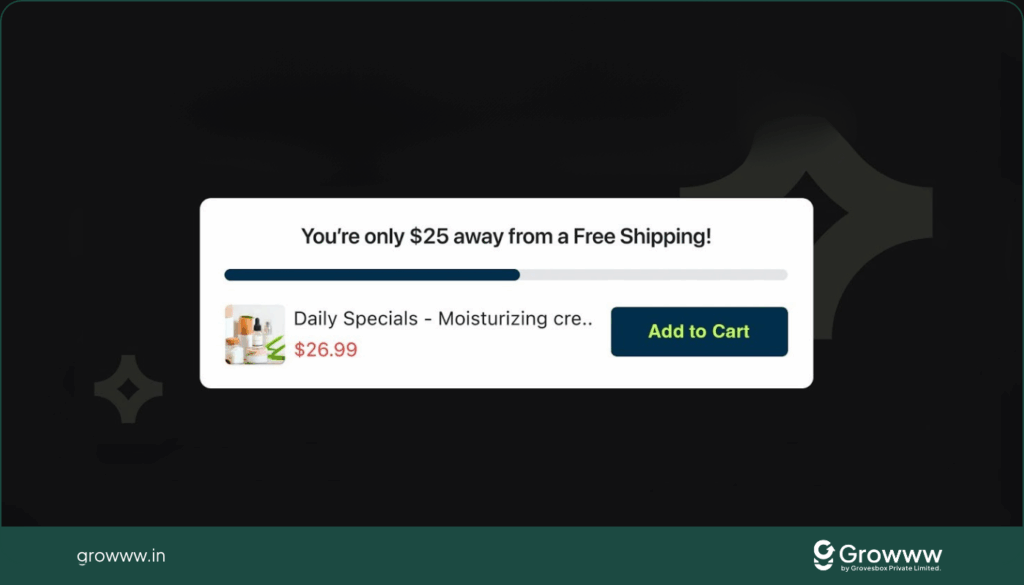
3. Free Shipping Progress Indicator
Why it matters:
- Shoppers will add extra items to unlock free shipping.
DIY Fixes:
- Add progress bar: “You’re $12 away from Free Shipping!”.
Example:
Gymshark uses a bold progress bar in their mini-cart, leading to higher AOV.
4. Empty Cart = Shopping Opportunity
Why it matters:
- An empty cart is a dead end.
DIY Fixes:
- Add a CTA: “Your cart is empty. Discover our best-sellers →”.
Example:
Etsy suggests trending items in empty carts.
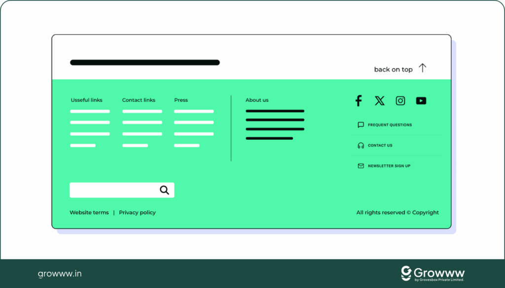
Footer CRO Checkpoints
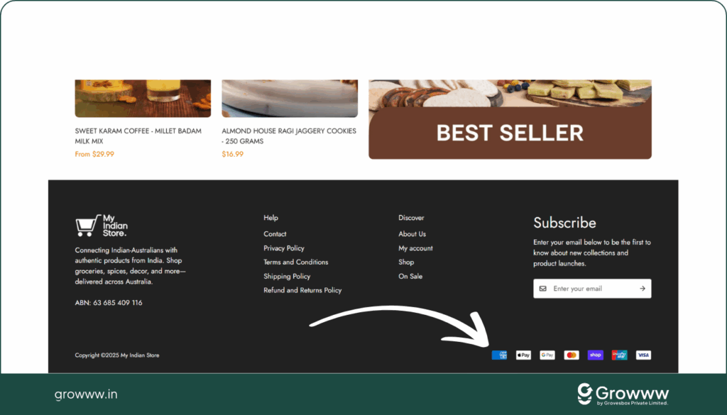
1. Build Trust in the Footer
Why it matters:
- The footer is where users go for validation (policies, trust signals, company info).
DIY Fixes:
- Add trust badges (Norton, SSL Secure, Verified by Visa).
- Show physical address & customer service contacts.
Case Example:
Warby Parker includes address, phone, email, and “Shop with confidence” in footer.
2. Social Proof in Footer
Why it matters:
- Showing real followers and activity builds credibility.
DIY Fixes:
- Display Instagram feed or “Join 250K happy customers.”
Example:
Glossier highlights “2M+ Instagram followers” in their footer.
3. Useful Links (But Not Overloaded)
Why it matters:
- Shoppers want quick access to return policies, FAQs, and categories.
DIY Fixes:
- Include: Returns, Shipping, Contact, About, Categories.
- Exclude: Overwhelming corporate/legal clutter.
We’ve now covered: General → Navigation → Search → Cart Widget → Footer.
Next up:
- Homepage CRO Checkpoints (first impressions, hero banners, social proof).
- Landing Page CRO (direct-response optimisation).
- Category & Product Page CRO (the money pages).
- Cart, Checkout & Thank You Page CRO (closing the deal & boosting AOV).
Homepage CRO Checkpoints
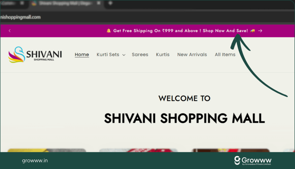
1. Promote Site-Wide Offers at the Top
Why it matters:
- Offers like Free Shipping or 10% off today can hook first-time visitors immediately.
- Placing this at the very top makes sure nobody misses it.
DIY Fixes:
- Use a sticky announcement bar at the top.
- Add urgency: “Only today” or “Ends midnight”.
- Add CTA: “Shop best-sellers now →”.
Case Example:
Fashion Nova’s top bar always shows “40% Off Everything – Use Code…” with a clickable CTA. It drives instant action.
2. Professional First Impression
Why it matters:
- Visitors form an opinion about your site in 0.05 seconds.
- A cluttered or outdated design screams “untrustworthy”.
DIY Fixes:
- Use a clean hero banner with 1–2 clear CTAs.
- Keep colors, fonts, and images consistent with your brand.
Analogy: This is like your physical store entrance. A well-lit, neatly arranged shop attracts; a messy one repels.
3. Clear Value Proposition
Why it matters:
- Visitors must instantly know: “What do you sell?” and “Why buy from you vs. others?”.
DIY Fixes:
- Add a short tagline (e.g. “Eco-Friendly Fashion That Doesn’t Cost the Earth”).
- State benefits, not just features.
Case Example:
Allbirds’ homepage headline: “Better Shoes in a Better Way” — eco-friendly, comfortable, stylish.
4. Visual Hierarchy (Guides the Eye)
Why it matters:
- The human eye follows a natural Z-pattern or F-pattern.
- If you don’t guide visitors, they get overwhelmed.
DIY Fixes:
- Place the main CTA above the fold.
- Use larger fonts for key headings.
- Keep enough white space.
5. High-Quality Imagery (Not Stock Photos)
Why it matters:
- Humans are visual; bad photos = low trust.
- Lifestyle/product-in-use photos outperform plain stock photos.
DIY Fixes:
- Invest in professional product photography.
- Show products in real-life context (e.g. sofa in a living room, not on a white void).
Case Example:
Glossier uses customer-generated Instagram photos right on their homepage.
6. Strong CTAs Above the Fold
Why it matters:
- Many visitors never scroll down.
- If your CTA is buried, you lose them.
DIY Fixes:
- Add 1–2 CTAs like “Shop Women” and “Shop Men”.
- Keep them bold, clear, and visible.
7. Showcase Benefits of Shopping With You
Why it matters:
- Differentiates you from Amazon & big players.
DIY Fixes:
- Use badges like:
- 🚚 Free Shipping Over $50
- 🔄 30-Day Returns
- 🌱 Sustainable & Eco-Friendly
Case Example:
Everlane promotes “Radical Transparency” about pricing — a unique reason to shop.
8. Highlight Key Categories & Offers
Why it matters:
- Don’t force users to dig — show them what’s hot.
DIY Fixes:
- Add clickable banners like “New Arrivals,” “Sale 30% Off,” “Best-Sellers.”
- Use clear, attractive category images.
Example:
Sephora has a “Just Dropped” section — it taps into urgency & discovery.
9. Add Social Proof & Trust
Why it matters:
- Shoppers trust peers over brands.
DIY Fixes:
- Add customer reviews directly on homepage.
- Display logos of press mentions or celebrities.
- Add “19,222 products shipped last month” — numbers build credibility.
Case Example:
Gymshark highlights millions of Instagram followers and UGC (user-generated content).
10. Show Your Story (Founder, Mission, Values)
Why it matters:
- Shoppers connect with humans, not faceless stores.
DIY Fixes:
- Add a short “Our Story” section with founder photo.
- Share values: eco-friendly, handcrafted, family-owned.
Example:
TOMS Shoes built an empire by sharing their “One for One” mission (buy one, donate one).
11. Easy Contact Options
Why it matters:
- Users want to know they can reach you if something goes wrong.
DIY Fixes:
- Add live chat widget.
- Add phone number or email in header/footer.
Case Example:
Zappos’ legendary customer support number is everywhere — it boosts confidence.
12. Personalization for Returning Visitors
Why it matters:
- Returning visitors want continuity, not a restart.
DIY Fixes:
- Show “Recently Viewed” items.
- Offer “Welcome back, Raghoo 👋 Here’s where you left off.”
Example:
Amazon nails this with “Buy it again” & “Continue where you left off.”
Landing Page CRO Checkpoints
Landing pages are often used for ads or campaigns. Their job: one clear action (buy, signup, download).
1. No Distractions (One Goal)
Why it matters:
- Every link that takes users away reduces conversions.
DIY Fixes:
- Remove nav menu, footer, external links.
- Keep only CTA(s) related to the offer.
Example:
Unbounce-style landing pages strip everything except the campaign goal.
2. Direct-to-Checkout CTA
Why it matters:
- Landing page users already have high intent. Don’t force extra clicks.
DIY Fixes:
- “Buy Now” should jump straight to checkout (skip cart page).
Case Example:
For limited-time offers, brands like Kylie Cosmetics send shoppers straight to checkout.
3. Sticky CTA Bar
Why it matters:
- If a user scrolls down a long sales page, they shouldn’t lose the CTA.
DIY Fixes:
- Add a sticky bottom bar: “Add to Cart – $29.99.”
4. Product Overview Above the Fold
Why it matters:
- Don’t bury key product info.
DIY Fixes:
- Show name, price, benefits, and main CTA without scrolling.
Example:
Apple’s landing pages: bold product photo + headline + CTA → “Buy.”
5. Social Proof on Landing Pages
Why it matters:
- Campaigns work better with trust signals.
DIY Fixes:
- Add customer reviews.
- Add “Used by Fortune 500 execs” logos.
Example:
Basecamp’s famous landing page highlights logos of brands using their software.
Category Page CRO Checkpoints
Your category page is like a shopping aisle in a supermarket — it must be well-organised, scannable, and persuasive.
1. Sorting Options
Why it matters:
- Shoppers want control (price low-to-high, best-sellers, new arrivals).
- Without sorting, users may abandon if they can’t find what they want quickly.
DIY Fixes:
- Add sorting dropdown (top-right).
- Include “Best-Sellers” & “Most Popular.”
Example:
Amazon offers multiple sort options, but highlights “Featured” to keep results relevant.
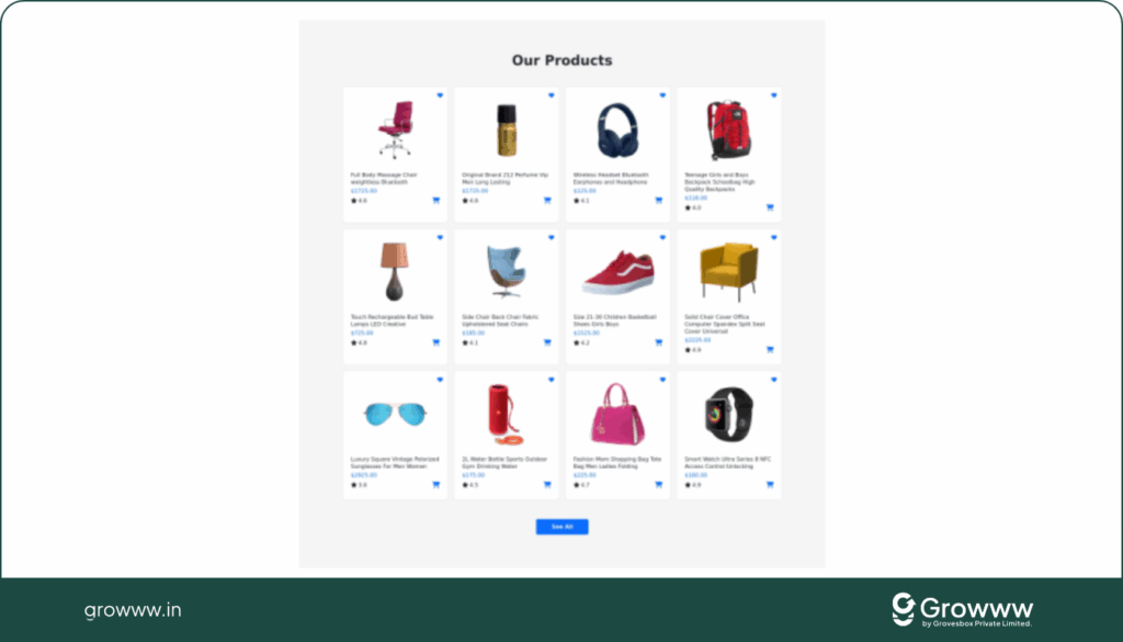
2. Scannable Product Grid (Consistency is Key)
Why it matters:
- Users scan products in milliseconds; inconsistent layouts slow them down.
DIY Fixes:
- Use consistent image size, background, angle.
- Keep product cards equal size.
- Show 3–4 products per row (desktop).
Case Example:
Zara’s category grid is ultra-clean: consistent white backgrounds and uniform spacing.
3. Hover Effects for More Details
Why it matters:
- Users don’t want to click each product to compare.
- Hover reveals second photo or key info.
DIY Fixes:
- Show 2nd product image (e.g. back view of dress).
- Show quick “Add to Wishlist” or “Quick View.”
Example:
ASOS shows alternate product photos on hover.
4. Clear Product Info on Cards
Why it matters:
- Decision-making happens right in the grid.
DIY Fixes:
Each product card should show:
- Title
- Old price (strikethrough) + new price
- Discount badge (e.g. “-30%”)
- Star ratings (with review count)
- Available sizes/colors
Case Example:
H&M adds “Only 2 left” scarcity directly in category grid.
5. Scarcity & Stock Indicators
Why it matters:
- Scarcity nudges action.
DIY Fixes:
- “Only 1 left in stock” in red text.
- Out-of-stock items grayed out with “Notify me.”
Example:
Sephora shows “Just Missed It” on out-of-stock products — scarcity becomes proof.
6. Useful Filters (Especially Mobile)
Why it matters:
- Without filters, users get overwhelmed by too many options.
DIY Fixes:
- Add filters: price, size, color, rating.
- Use visual selectors (color swatches, price sliders).
- Filters should be sticky on mobile.
Example:
IKEA lets users filter furniture by size, material, and price — super intuitive.
Product Page CRO Checkpoints
This is where the final decision happens. Think of it as your digital sales rep.
1. Clear Product Title & Subtitle
Why it matters:
- Must be descriptive + persuasive.
DIY Fixes:
- Title ≤ 65 characters (for SEO).
- Subtitle with power words: “Premium,” “Eco-Friendly,” “Exclusive.”
Example:
Apple: “MacBook Air 13” – Supercharged by M2 Chip.”
2. High-Impact Product Gallery
Why it matters:
- 93% of shoppers say visuals are the #1 purchase factor.
DIY Fixes:
- Show multiple angles.
- Enable zoom & swipe.
- Add videos (demo, unboxing).
- Show variant-specific images (red shirt = red photo).
Case Example:
ASOS lets users see clothes on models of different sizes.
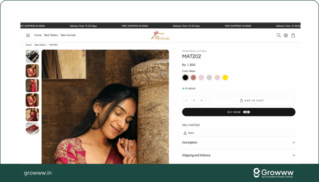
3. Standout CTA Area (Add to Cart)
Why it matters:
- CTA is the money button. If it blends in, sales drop.
DIY Fixes:
- Make it the most visible element.
- Use a contrasting colour (not used elsewhere).
- Copy should say action: “Add to Cart,” “Buy Now,” “Proceed to Checkout.”
Example:
Amazon’s big yellow “Add to Cart” is globally recognized.
4. Pricing Psychology
Why it matters:
- The way the price is displayed changes perception.
DIY Fixes:
- Show old price with strikethrough + % saved.
- Localize currency (₹, $, €, etc.).
- Add instalment options for high-ticket items.
Case Example:
Nike: ₹5,999 → ₹3,999 (33% OFF) + “Free Shipping.”
5. Benefits Before Features
Why it matters:
- Customers buy outcomes, not specs.
DIY Fixes:
- Bullet point benefits: “Stay warm in winter, breathable fabric.”
- Accordion for longer technical info.
Analogy: Don’t sell the drill. Sell the hole in the wall.
6. Social Proof (Trust Triggers)
Why it matters:
- 95% of shoppers read reviews before buying.
DIY Fixes:
- Add verified buyer reviews.
- Show UGC (Instagram photos, happy customers).
- Highlight numbers: “19,222 sold this month.”
Example:
Amazon: “4.6 stars from 5,324 reviews” + customer photos.
7. Urgency & Scarcity Triggers
Why it matters:
- Fear of missing out (FOMO) drives conversions.
DIY Fixes:
- “Only 3 left.”
- “Order in next 2h for same-day shipping.”
- Show live views: “12 people are viewing this now.”
Case Example:
Booking.com uses urgency everywhere — “5 rooms left” → massive CRO uplift.
8. Cross-Sell & Upsell
Why it matters:
- Product pages are perfect to increase Average Order Value (AOV).
DIY Fixes:
- Show “Frequently Bought Together.”
- Offer bundles (e.g. 2 for 20% off).
Example:
Amazon’s “Customers who bought this also bought…” is responsible for 35% of their revenue.
9. Clear Policies (Returns, Shipping, Guarantee)
Why it matters:
- Doubts kill sales.
DIY Fixes:
- Show shipping info near CTA: “Delivery in 3–5 days.”
- Return guarantee: “30-day money back.”
Case Example:
Zappos built its brand on free returns, removing purchase hesitation.
10. Easy Variant Selection (Size, Color, Quantity)
Why it matters:
- Frustrating selectors = lost sales.
DIY Fixes:
- Use swatches, not dropdowns.
- Auto-update price + image when option selected.
- Add size chart popup (mobile-friendly).
Example:
H&M lets users instantly switch colours with thumbnail swatches.
Cart Page CRO Checkpoints
The cart page is like the queue at the supermarket. If it’s slow, confusing, or frustrating, people walk away (cart abandonment).
1. Clean & Uncluttered Cart Design
Why it matters:
- Users want confirmation, not distraction.
- A messy cart introduces doubt.
DIY Fixes:
- Show product photo, name, chosen variant, price, and subtotal clearly.
- Avoid extra banners/links.
2. Urgency Triggers
Why it matters:
- Keeps momentum alive.
DIY Fixes:
- Show “Items reserved for 10 minutes” or “Order now for same-day dispatch.”
- Add scarcity (“Only 2 left in stock”).
Case Example:
Booking.com-style urgency messages lifted conversions by 14% in tests.
3. Free Shipping Progress Bar
Why it matters:
- Increases Average Order Value (AOV).
DIY Fixes:
- Add: “You’re $12 away from free shipping → Add a bestseller now.”
Example:
Gymshark’s cart shows a progress meter that nudges upsells.
4. Easy Quantity Changes & Removal
Why it matters:
- Users don’t want to restart if they make a small mistake.
DIY Fixes:
- Inline +/- buttons for quantity.
- “Remove” button with one click.
5. Cart-Safe Upsells & Cross-Sells
Why it matters:
- Cart is a perfect moment for relevant add-ons.
DIY Fixes:
- Add “Frequently Bought Together” under the cart.
- Keep offers inexpensive & relevant.
Example:
Amazon adds “Customers also bought…” right before checkout.
6. Prominent Checkout CTA
Why it matters:
- The Proceed to Checkout button is the money button.
DIY Fixes:
- Make it the largest element on the page.
- Copy: “Secure Checkout →” with lock icon.
Example:
Best Buy uses “Continue to Secure Checkout” + Norton badge below for trust.
Checkout Page CRO Checkpoints
The checkout page is like the cash counter. This is where abandonment peaks (average: 69% globally). Optimising here = instant revenue lift.
1. Guest Checkout
Why it matters:
- Forcing account creation is a top abandonment reason.
DIY Fixes:
- Offer guest checkout.
- Option to create an account after purchase with one click.
Case Example:
ASOS reduced checkout abandonment by 50% when they added guest checkout.
2. Progress Indicators
Why it matters:
- Shoppers hate uncertainty.
DIY Fixes:
- Use steps: Shipping → Payment → Review → Done.
- Add a progress bar on top.
3. Minimise Form Fields
Why it matters:
- The more fields = the more drop-offs.
DIY Fixes:
- Single column form.
- Use auto-complete for addresses.
- Combine fields where possible (e.g. First + Last Name).
Benchmark: Baymard Institute found reducing fields from 16 → 12 improved completion rates by 12%.
4. Trust & Security Signals
Why it matters:
- Users want to feel safe giving card details.
DIY Fixes:
- Add SSL lock icon, Norton/Verisign badge.
- Copy: “Secure & encrypted payment.”
Case Example:
Blue Apron added “100% Secure Checkout” under the pay button → drop-offs decreased.
5. Multiple Payment Options
Why it matters:
- If users don’t see their preferred method, they leave.
DIY Fixes:
- Offer PayPal, Apple Pay, Google Pay, UPI (India), Buy Now Pay Later (Klarna, AfterPay).
6. Order Summary Visible
Why it matters:
- Surprises at checkout = abandonment.
DIY Fixes:
- Show cart items, shipping, taxes, and discounts before the final pay click.
Case Example:
Zappos highlights “Free Returns” + total cost before purchase — reduces hesitation.
7. Inline Validation for Errors
Why it matters:
- Restarting the form kills momentum.
DIY Fixes:
- Highlight errors instantly (red outline + hint).
- Example: “Email format invalid. Try john@domain.com”.
8. Checkout Upsells & Order Bumps
Why it matters:
- Last chance to increase order value.
DIY Fixes:
- Add order bump checkboxes:
- “Add Gift Packaging – $3”
- “Get Faster Shipping – $5”
- One-click upsells before “Thank You” page.
Example:
ClickFunnels-style upsells can add 20–30% AOV li
Thank You Page CRO Checkpoints
Most stores treat the Thank You page as a dead-end. In reality, it’s a goldmine for retention, referrals, and AOV boosting.
1. Confirm & Congratulate
Why it matters:
- Reassures users their order is complete.
DIY Fixes:
- Headline: “🎉 Order Confirmed! Thanks for shopping with us, Raghoo.”
2. Clear Order Summary & Delivery Info
Why it matters:
- Reduces post-purchase anxiety.
DIY Fixes:
- Show order details, delivery date, courier info.
- Add “Track Your Order” button.
3. Easy Support Access
Why it matters:
- Customer trust continues post-purchase.
DIY Fixes:
- Add live chat, phone, or email.
4. Post-Purchase Upsell
Why it matters:
- Users are still in buying mode.
DIY Fixes:
- Offer “Add another product to combine with your order.”
- Offer discounts for bundles: “Add this for 30% OFF — ships together.”
Case Example:
Amazon’s “Buy Again / Related Products” boosts repeat purchases instantly.
5. Loyalty & Referral Hooks
Why it matters:
- Thank You page is the best time to build long-term engagement.
DIY Fixes:
- Give coupon for next order (“10% OFF your next purchase”).
- Add referral code: “Share with a friend & get $5.”
Case Example:
Dropbox used referral bonuses on confirmation pages — it fueled 3900% growth
6. Encourage Social Sharing
Why it matters:
- Turning buyers into promoters = free marketing.
DIY Fixes:
- Add “Share your order on Instagram/Twitter.”
- Give a reward: “Tag us & win a $50 gift card.”
CRO Playbook Recap
We’ve now built a full DIY handbook covering:
- General CRO Checkpoints (speed, CTAs, design basics)
- Navigation (mega menus, sticky nav, logical flow)
- Search (autocomplete, no-results rescue, mobile)
- Cart Widget (mini-cart, free shipping bar, accessibility)
- Footer (trust, policies, social proof)
- Homepage (offers, value prop, social proof, personalisation)
- Landing Pages (single focus, sticky CTAs, direct-to-checkout)
- Category Pages (grids, filters, scarcity, consistency)
- Product Pages (gallery, CTA, pricing, reviews, urgency, upsells)
- Cart Page (clarity, urgency, free shipping nudges, cart-safe upsells)
- Checkout Page (guest checkout, progress bar, trust, payments, validation)
- Thank You Page (confirmation, upsells, loyalty, referrals, sharing)
Final Action Plan
If you’re a business owner or marketer implementing this:
- Audit your store → Compare against each checkpoint.
- Prioritise high-impact areas → Cart, Checkout, Product Pages first.
- Test & measure → Use A/B testing tools (Google Optimise, VWO, Optimizely).
- Iterate continuously → CRO is not a one-time task.
Even fixing 5–10 leaks from this checklist can double conversions without increasing ad spend.